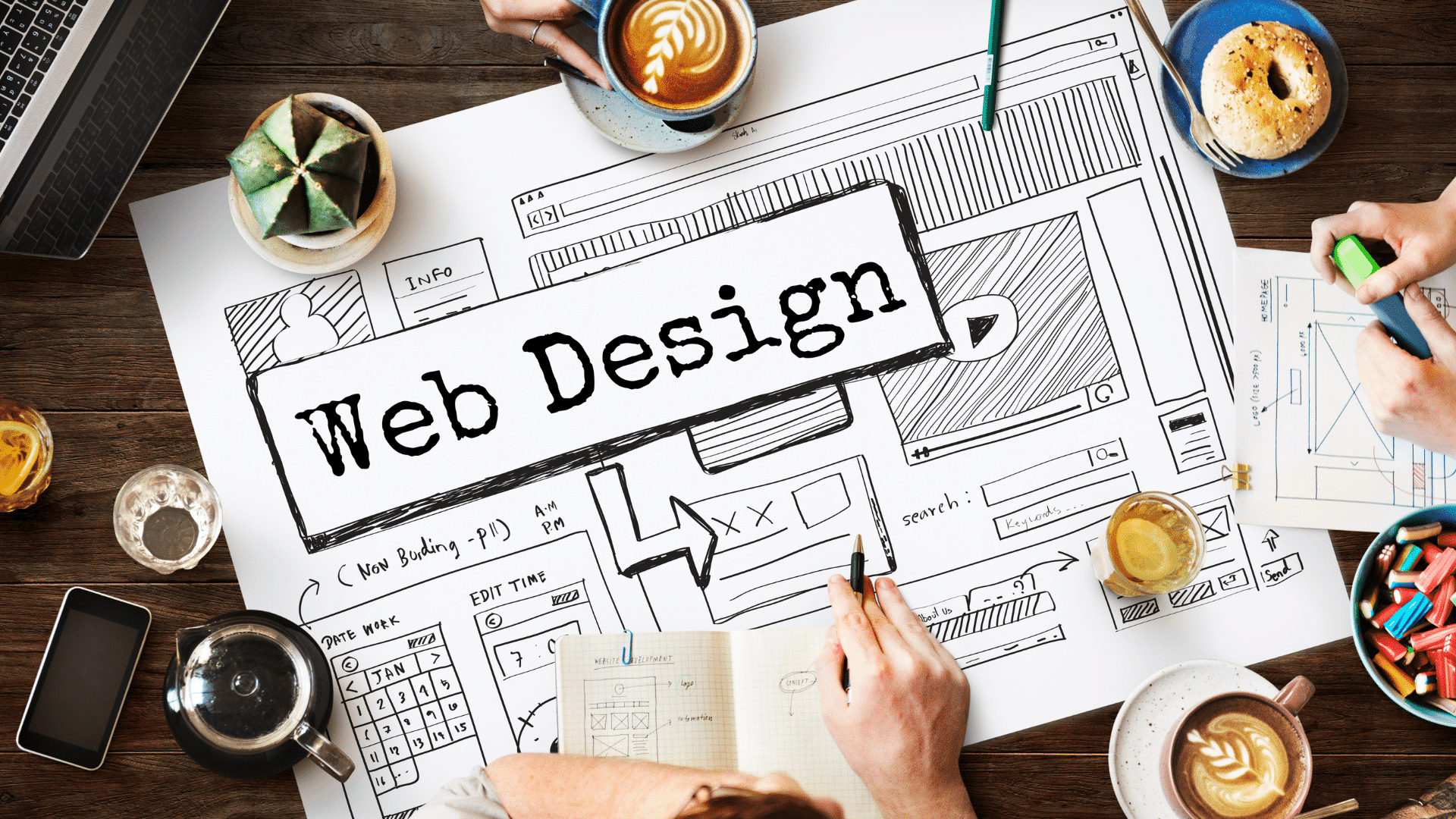
Web Design Trends to Increase Your Website's Conversions
Though trends come and go, there’s something to be said for when your website just looks old. A dated website can lead people to question your credibility as a business or turn away because what they’re looking at is just plain ol’ ugly.
Many web design trends are driven by their effectiveness at converting potential customers into paying consumers because of best practice design that makes use of user behavior tendencies. As such, this list of 2016 web design trend highlights design elements that help to boost conversions. It isn’t just about visual style, it’s about being on point with your design to sway your visitors to be full fledged fans and supporters of your business.
Here you go:
Full screen images capture the attention of a website visitor. We can’t help but stop and stare at something pretty. Wouldn’t you rather look at an image in full size instead of a mini box that you have to squint to make out what it depicts? Large images create a kind of interruption in our activities, forcing us to take notice and in turn contribute to higher levels of conversion.
Split screen layouts are great for highlighting two primary elements of equal importance and allowing the user the ability to navigate quickly and easily to what they are looking for. By creating a split screen as your landing page, your visitors can choose which direction they need to go without having to navigate through subpages to find it. The quicker they can find what they’re looking for, the more likely they are to convert.
Your Calls to Action (CTAs) should stand out and draw the attention of your visitors quickly. This can easily be achieved by giving your CTAs a burst of color that pops against an otherwise neutral or contrasting colour palette. Whether you’re asking your visitors to sign up, learn more, complete a form, or share socially, having your CTAs “light up” against the dark, helps people notice and in turn, take action.
Prioritized navigation gets rid of the clutter by hiding what’s not most important and showcasing what is. We’ve mentioned this before in our Website Do’s and Don’ts, how having too many choices can lead to choice paralysis, causing indecisive visitors to not choose at all and instead leave your site. Make it easy for your web visitors by simplifying your website’s navigation elements to prioritize where you want them to go.
It’s as simple as asking for what you want. If you want leads, simply ask without bells and whistles distracting your users. Instead, make it simple, place your lead capture on its own in your landing page and use compelling copy that drives them to send you the info you need.
Videos are great rich media that help your website visitors come to know you. Videos are an awesome way to personalize your brand through product demos, welcome videos or testimonials. Letting people actually “see” who it is their visiting is a great way to establish trust with your potential consumers. The greater the trust, the more likely they’ll convert into full fledged fans and consumers.
Sticky CTAs are great for keeping your CTA visible at all times. Your CTA is the most important part of your page as this is the action you want your visitors to complete. Whether you keep it sticky at the header for desktop views or at the bottom for mobile viewing, having it always available is good practice.
Inspired by Pinterest, this web design trend allows website visitors to quickly access whatever it is they are on the hunt for, which is usually also where they are most likely to convert.
Again, eliminating clutter and putting the focus on what’s important is why single column CTAs are effective. By getting rid of side bar distractions and positioning your CTA in a column all its own, visitors are more likely to click through.
It feels good to be able to identify with a website, as though it anticipates what you’re going to ask or seek out before you even know it. Using location and buying activity or browsing activity data enables you to personalize a user’s interaction with your page. Making things personal often leads to converting a potential customer into a paying consumer.
Check out this infographic by The Deep End Design which sums up visually everything we've discussed.