Website Dos and Don’ts: Top TIPS FOR A CONVERTING WEBSITE
Your website represents your business online, and your homepage is much like a welcome mat, greeting people when they first enter. You want them to stay and not turn away because they’re put off by something. That is, there are website dos and don'ts; i.e. like a type of online etiquette.
Much of this has to do with your website’s design, the user’s experience of your site and, of course, what your website has to say. If you want a converting website, you need to take the right steps. Here are a few best practice tips to keep your visitors on your website rather than having them looking elsewhere:

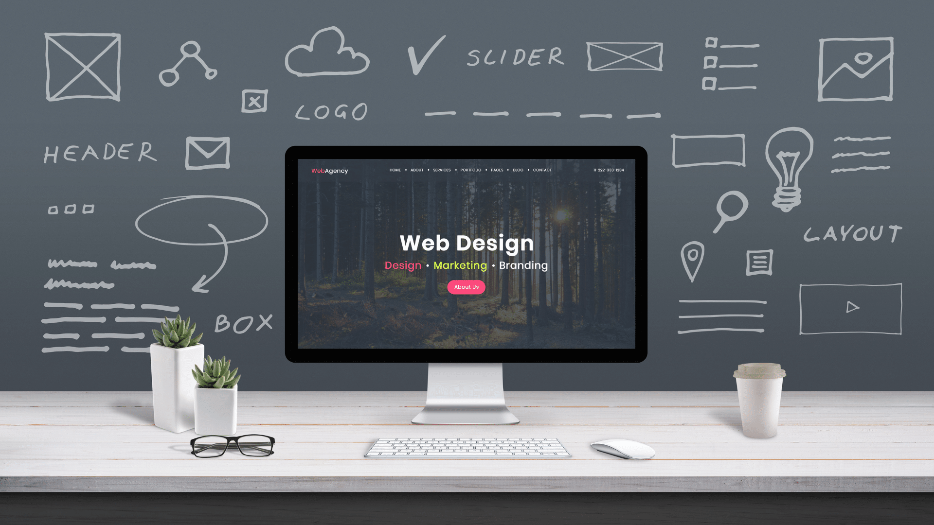
Simplicity is an art form. Steve Jobs noted that “Simple can be harder than complex. You have to work hard to get your thinking clean to make it simple.” We get that building a website is exciting, you want to promote your business and show off all the things that you can do. But TOO much, TOO soon, can be TOO overwhelming for a website visitor and send them looking elsewhere.
Think about the simplicity of Google’s user interface; it’s a single box that you type a question into. It’s not complicated. It knows what it intends to do – which is to answer a question for you. Granted, your site might not be as simple as a search engine (which isn’t simple at all, actually), but you want to pare down all the unnecessary items that can get in the way of your user’s experience.
Simplicity isn’t about being glaringly sparse with your content instead, it’s about doing away with all the extraneous stuff. We understand that you don’t want to miss an opportunity and are afraid that your users won’t get it, but you need to give them more credit.
The more and more approach is intimidating. Piling on buttons and options actually steers customers away. In fact, studies have shown that too much choice is not better. Having too many choices can result in “choice paralysis” causing us not to choose. People choose instead to avoid making a choice for fear that they’ll make the wrong one so they just walk away.
Another reason you want to simplify your site is because you want to minimize your page sizes. Page speeds matter to Google, as they want customers to have the best experience possible on the web. When your web pages take a long time to load, your website’s visitors won’t be happy nor will Google. So seriously, think hard about how you can clean up your website’s design.
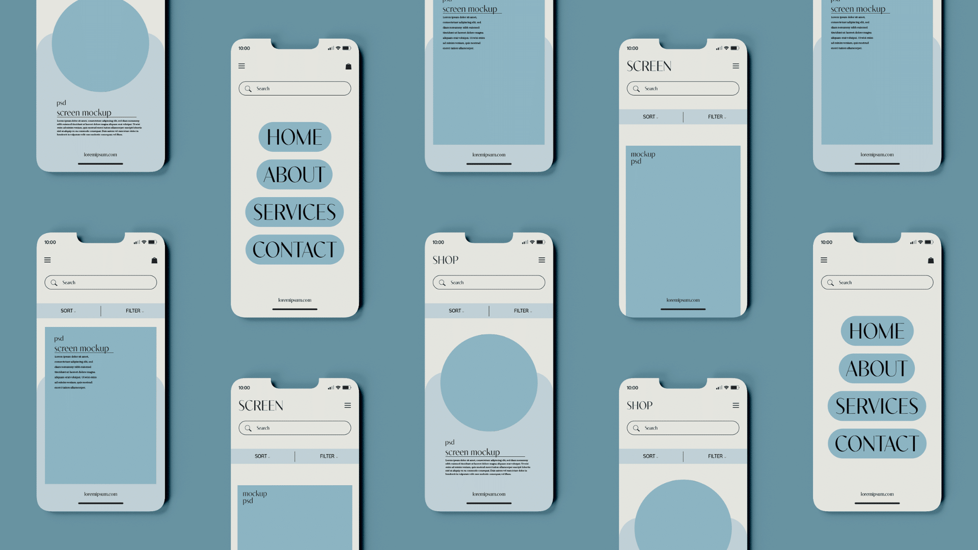
When your site is uncluttered, it’s easier to navigate through. Your navigation elements should direct your customers easily to what they are hoping to find. Have one main navigation menu with sub navigation elements as needed. Like we said previously, too many options are too confusing. Think about your main objectives when planning your website and create a site map from there.
Don’t reserve this vital information for just your contact page. Most people take to the web to find phone numbers or scope out an address on the go. So this information should appear either in the header or footer of your site so people can easily contact you. The more steps they have to go through to find your vitals, the more likely they’ll just give up and head elsewhere.
It’s important to Google and it should be important to you if you want to appear in mobile search listings. With people gravitating to their phones to search for things on the go, having a mobile-friendly site is imperative. 80% of mobile searches happened even with a computer available according to a study by Nielsen and Google Canada. So do make sure your website is optimized for mobile devices.
You want your content to read well and for your visitor’s eyes to feel comfortable on your site. The fonts and colours you use should be easy on the eyes, they shouldn’t cause a user to have to squint to read what you’re saying.
Also, it’s daunting to see a big block of text when you visit a website. You want to see something that your eyes can easily “scan” through – not something that looks like a medical journal or research paper. Studies using eye-tracking research have found that on average only 28% of the words on a webpage are actually read. People scan, they don’t read.
So:
Do use beautiful imagery
We are drawn to beauty; we can’t look away from it. Because our brains process visual information 60,000 faster than text, you’ll want to ensure that your website’s images are gorgeous. 90% of the information transmitted to our brains comes through visuals which highlights the importance of having great photography and graphics on your website. Like getting ready for a party, you’re not going to show up in sweatpants with your hair looking like a nest. No, you’re going to put something on that compliments your skin tone and makes you look magnificent. Dress your website up in the same way using beautiful imagery that aids the design.
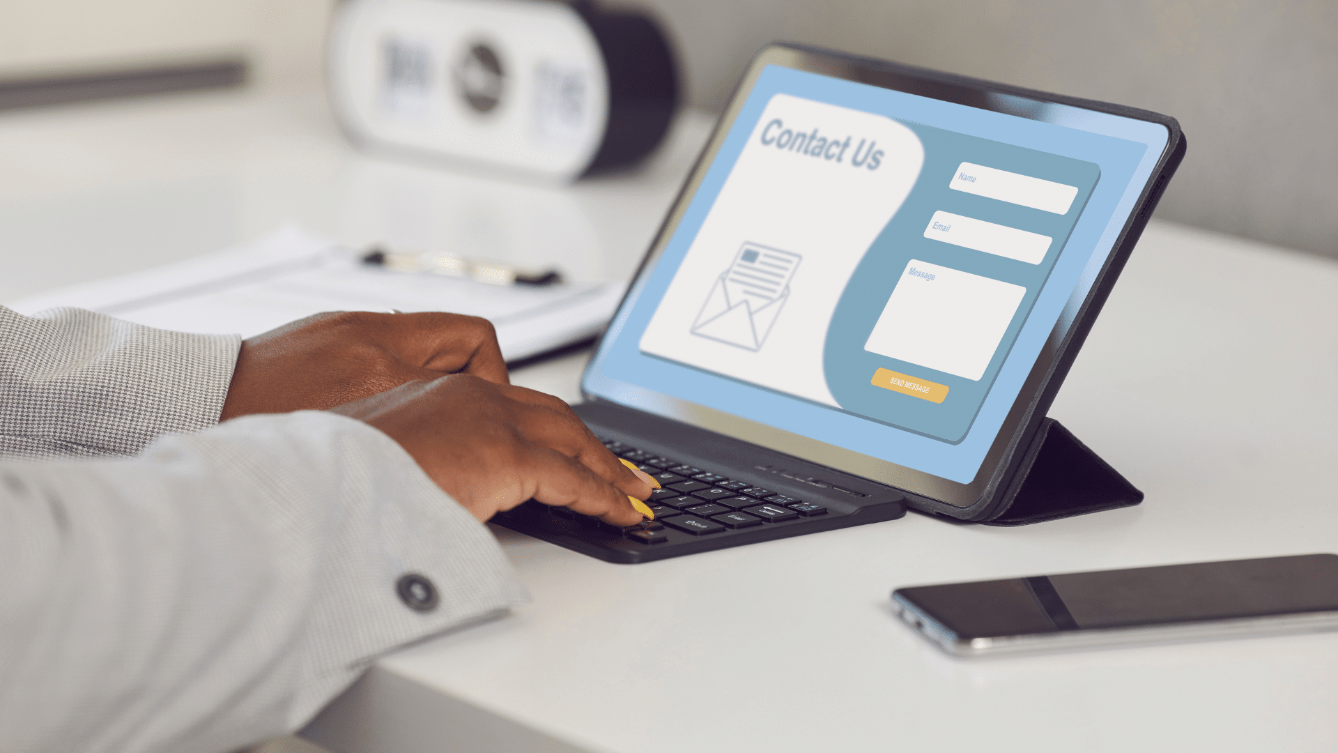
Have you ever left a store and abandoned a purchase because the checkout line was too long? We’re impatient beings, and this is magnified when we’re on the internet. We can’t even take the time to read web pages in full! Long contact forms with multiple fields of entry are scary, and they just feel long.
Again, think simplicity. Eliminating unnecessary form fields can significantly increase the conversion rate of your contact form. In a study conducted by HubSpot, they found by simply reducing the number of form fields in a contact form; conversion rates improved by nearly 50%. Think about what information you actually need from your customer and ask for only that.
Search Engine Optimization is vital if you want your website to be found when people search for you on the web. Check out our articles on Local SEO and 3 Essential SEO Tips for more information. Essentially, SEO is about ensuring that your website is optimized for search engines, such that when people type in inquiries into Bing or Google, your website shows up as the answer.
We’re talking content. Not only does having fresh content help you with your SEO endeavours, it also means that you continue to remain relevant to your audience. It shows that you’re not lazy about your business and that you take the time to make updates when necessary. You don’t want to be advertising a sale that is now long gone. You want whatever is on your website to be current so that you’re providing an authentic representation to your prospective customers.