How Typography Affects Your Web Design and Conversions
Typography isn’t typically what business owners think about when having a website designed. Generally, they’re thinking about what key lines of business they want to highlight, what words will be used to describe product offerings, what graphics will be paired alongside descriptions to properly reflect the brand and image they want to project online.
But, this commonly overlooked element of your website’s design is crucial when it comes to retaining your web visitor’s attention and comprehension. Typography plays a huge role in the overall feel and personality of your brand, your message and how all of this is received when web visitors view your web design.
Typography isn’t simply the words on the page but rather the way the words are presented. It goes beyond font choice even and involves typeface choice, line length, leading, kerning, tracking – all of which probably sounds like mumbo jumbo to you but to your web designer, matters immensely.
Let me explain:
Typeface: Typeface and fonts are different. A typeface refers to a group of letters, numbers and characters that share the same design or style. For example, Arial and Garamond are common typefaces. Think of typefaces as font families.
Font: Now a font, is a specific style of typeface with a specified width, size and weight. As an example, Arial is a typeface, whereas Arial 10pt bold is a font. Note the latter’s specifications.
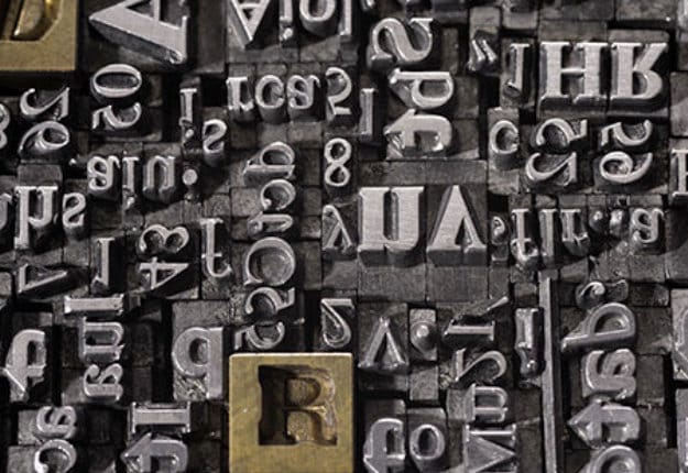
This distinction actually results from the olden days when printing presses had to manually set each individual letter which was imprinted on a metal block within a frame to create the page layout (there was no InDesign or MS Word for these folks). Then, ink would be rolled onto the meticulously put together metal blocks, followed by a sheet of paper pressed onto the surface to then then “print” the page.
Because they had all these tiny blocks of moveable type, it was necessary to make distinctions between Typefaces and Fonts. Typefaces signified all the blocks that shared the same design – for ex. Garamond. Whereas fonts denoted the particular subset of blocks for that typeface. For example, Garamond 12pt is different from Garamond 8pt bold. Keeping all your type set blocks in order definitely required the distinction.
K. Enough of the history lesson.
An experiment conducted by Errol Morris sought to find out if typeface could influence how people perceived the presented information. To discover the answer, an article entitled “Are You an Optimist or Pessimist?” ran in the New York Times with text from David Deutsch’s book The Beginning of Infinity. The passage was then followed by two yes or no questions asking readers whether they supported Deutsch’s claim and how sure they were of their answer.
The point wasn’t about the article at all, but rather, about the typeface used to present the article. The same text was presented in 6 different typefaces – Baskerville, Helvetica, Comic Sans, Computer Modern, Georgia, and Trebuchet. Compiling the answers of 40,000 unknowing participants, the results showed that Comic Sans inspired the highest amount of disagreement, meaning the text published using Comic Sans was perceived as not credible. Whereas, the same text presented using Baskerville found the most agreement among readers to the statements made.
The point being, the typeface selected to present the article influenced how readers perceived the information and whether or not they found it credible and agreed with it.
So yes, typography matters. It has the ability to alter your visitor’s perceptions of whether or not they “believe” what you have to say. In addition, it sets a mood for your brand and site, whether that’s formal or informal.
You’ll often see jewellery websites using serif fonts because these tend to lend a classic look to the site as opposed to a contemporary feel that is too trendy. They’d rather have that timeless appeal, rather than a this-will-come-to-pass kind of look. There is a reason why web designers gravitate towards using different typefaces for corporate sites and then switch it up for childcare facilities or pet-sitting services.
Businesses have different audiences they want to appeal to and different personalities and your typeface helps to reflect this.
Just like the text right above these words, typography helps to create visual hierarchies that allow more important elements to stand out. Note the visual weight of the subtitle above.
Typography allows designers to highlight key messages through size, colour and style choices. In this way, they are able to design a website where your calls to action are prominent and stand out from the rest of the text. Because it’s a key conversion point for your business, a great designer will draw your web visitors eye to this CTA without it looking garish or out of place.
Other ways typography helps to create visual hierarchies include using bullet points, headings or subheadings, and bolded text to guide the reader along in their journey through your text as well as indicate when something is important.
Typography is crucial for helping your web visitors understand and comprehend the information you offer effortlessly. A well-designed site using great typography ensures the focus remains on the content and not on the effort required to read it. When kerning is too tight and the letter density too great, it can stress your web visitor’s eyes and this subconsciously or consciously causes irritation. Regardless of what the site’s copy says, if it isn’t presented in a manner that is easy to decipher then your web visitors will feel off balance reading the words and may find themselves turning elsewhere for info.
Need a professional-looking website that has all the bells and whistles? Our team of designers will make your vision come to life with no detail spared. Contact us today to get started!